Atlantica is Hector Network’s NFT platform. Hector Network is an expansive decentralized ecosystem run by a utility token, HEC, and complemented by the TOR stablecoin; with a market cap of $10million
Create a showcase page for an NFT platform, so users can view and interact with the newest/most popular NFT collections. This is a launchpad where creators can upload their upcoming NFT collections to gain traction/investors. You will be creating the layout of the showcase page, which features all the latest/most popular collections in the form of project cards. This page must be organised well to be visually interesting while not being too overwhelming. This will be broken up into 3 parts Header, Showcase (with various project cards showing which collections are in the Upcoming phase, Early Access, or In Progress), and Footer.
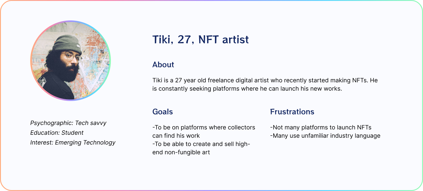
PERSONA
SKETCHING
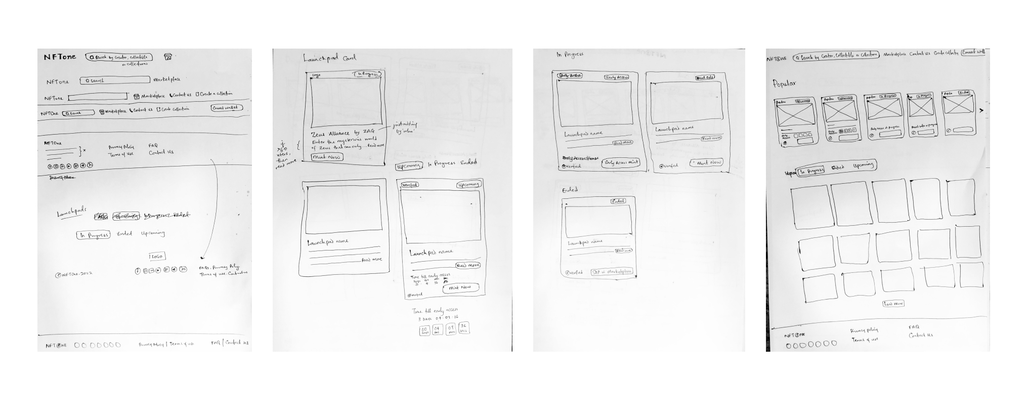
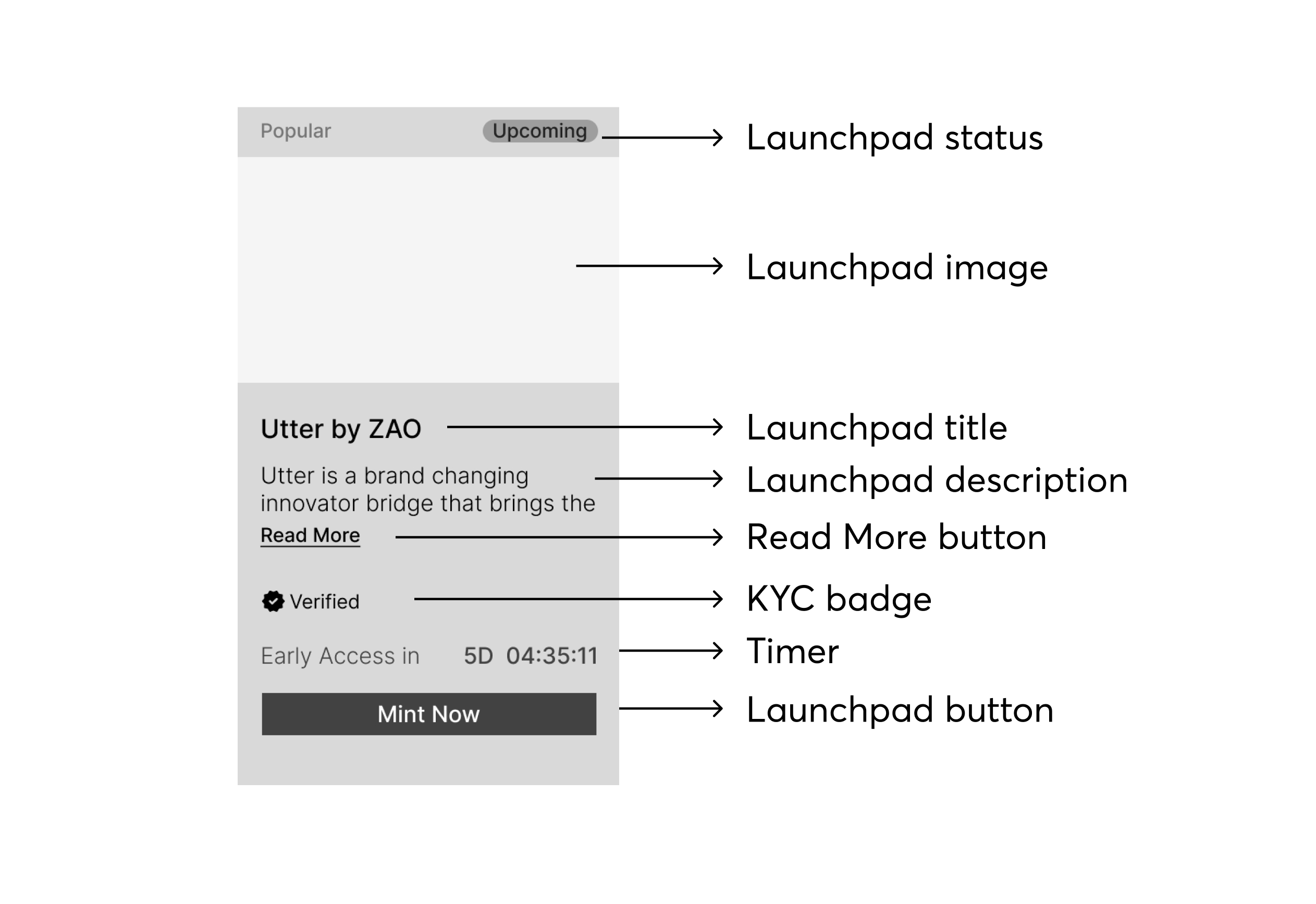
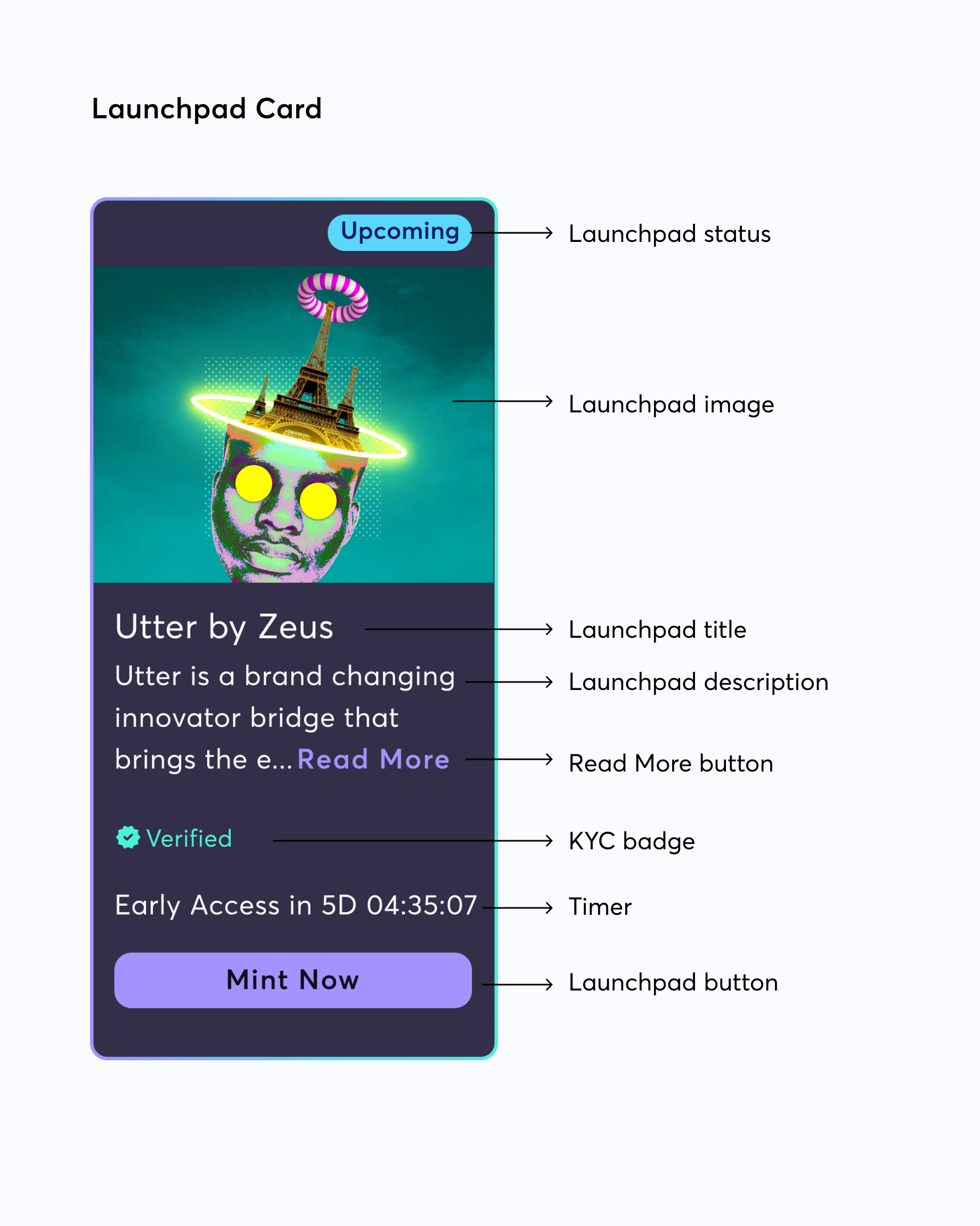
After gaining clarity on the brief and stakeholder expectations, I started my design process making sketches of what the parts of the Showcase page would look like. I wanted the logo and “Connect Wallet” buttons to stand out on the Header. For the Project Cards, my idea was to make them as compact as possible, like a card you would hold in your hands. The 2 most important parts I tried to highlight were the Image and the CTA button. I planned for a simple footer arranged horizontally (desktop) since it didn’t have so many links.
DIGITAL WIREFRAME
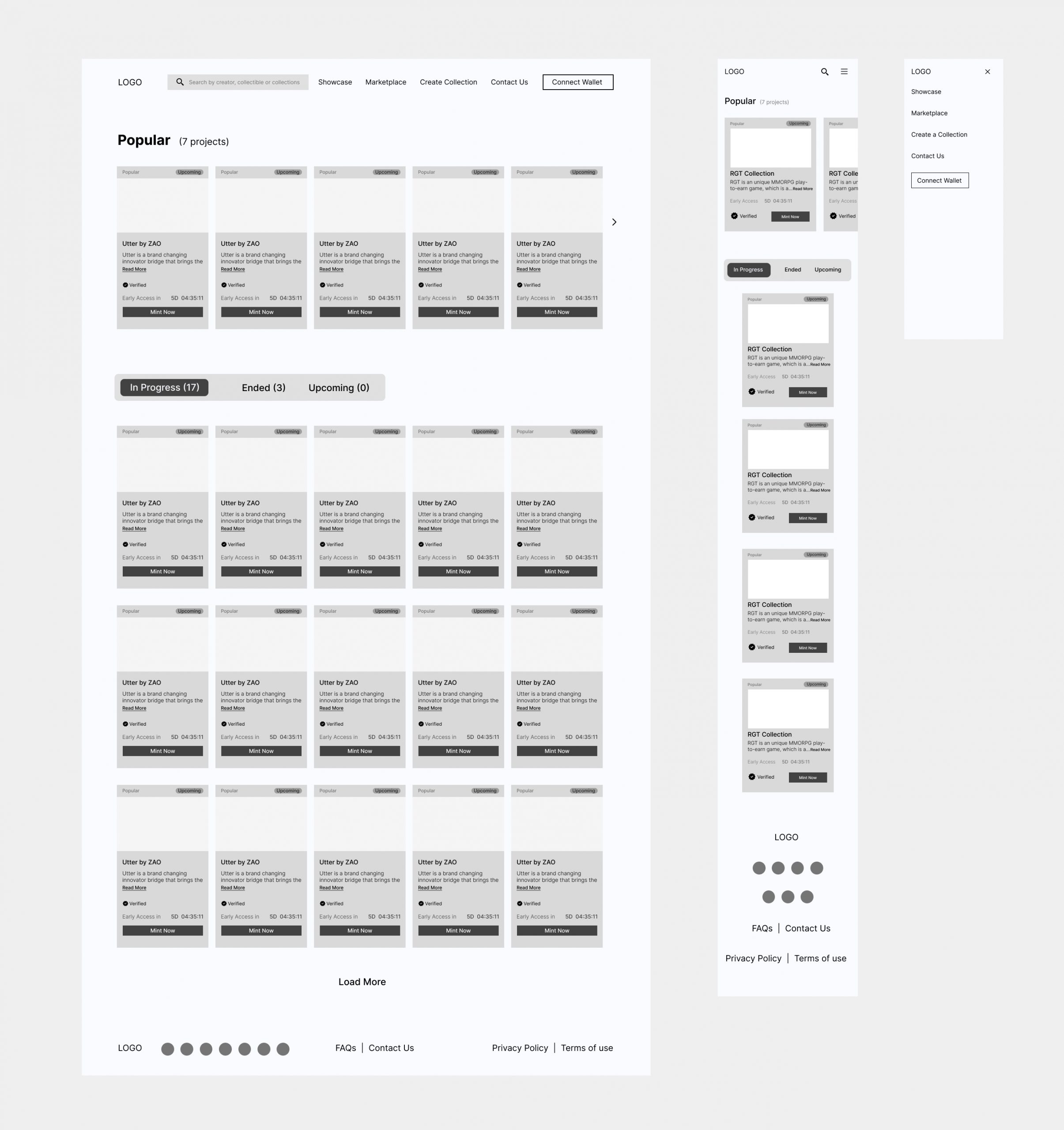
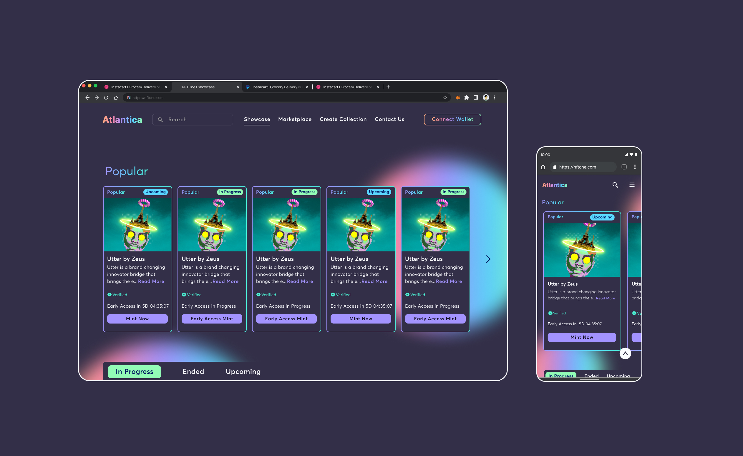
As I designed the low-fidelity wireframes, I became aware of how much space the project cards would require. Since the brief specifically noted that the “Popular” section would show 5 cards at a time, I made that the rule for the entire page. That meant the cards had to be long enough to accommodate all the information it was supposed to carry without compromising on the space for image and CTA and negative space. Having 5 cards horizontally has its own advantage – it will allow users to see more cards simultaneously and reduce the amount of scrolling on the desktop. However, a 3 or 4-card horizontal display may be ideal, especially in a scenario where the cards are expected to hold more information.
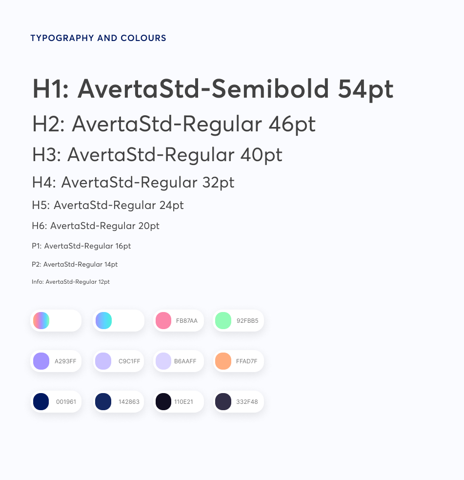
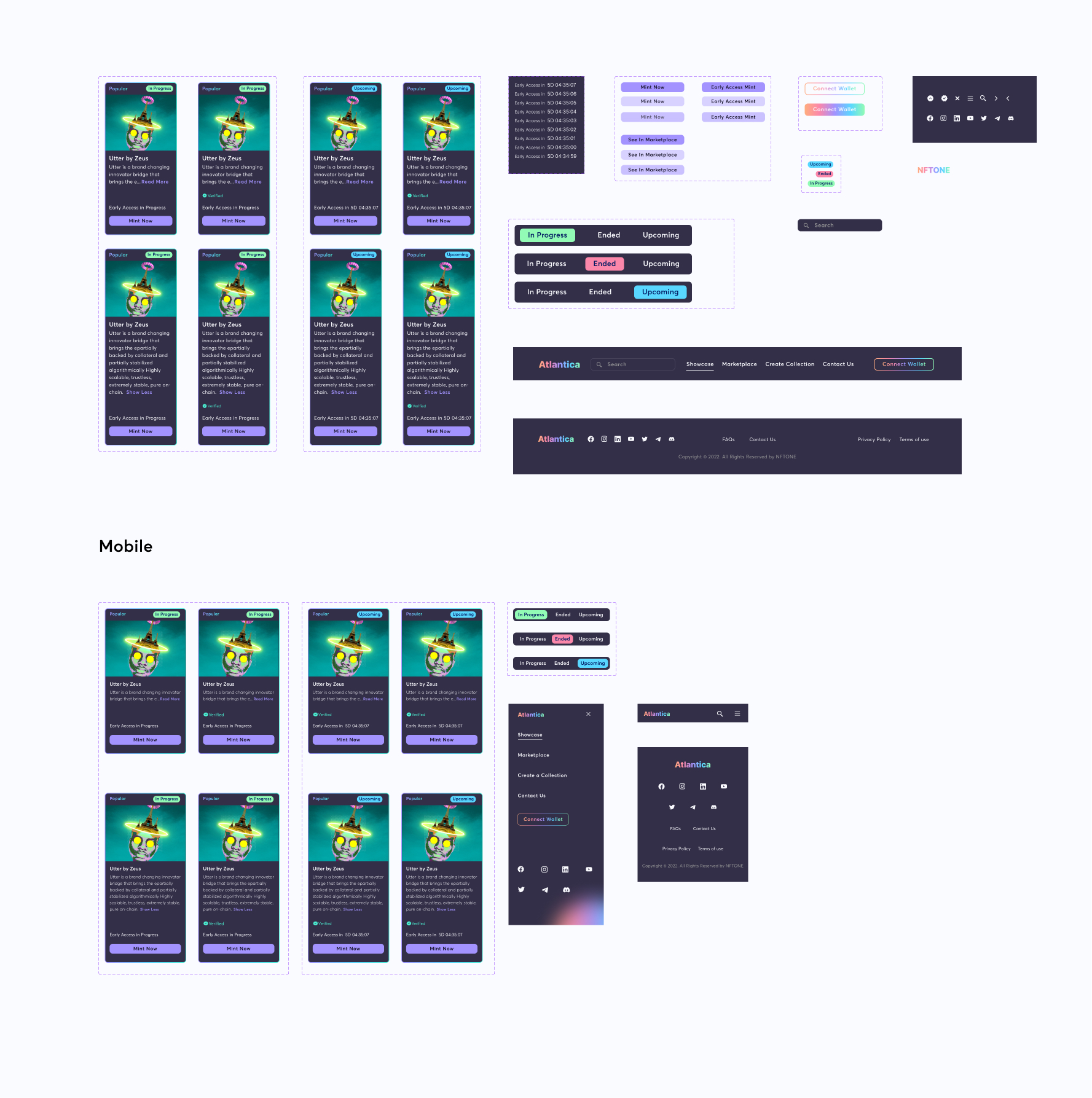
STYLE GUIDE & COMPONENTS
Before delving into the high-fidelity mockups – applying visual design principles to my low-fidelity design, I designed the components. This made my work faster as I several times needed to iterate before I was able to reach a final design.
HIGH FIDELITY MOCKUPS
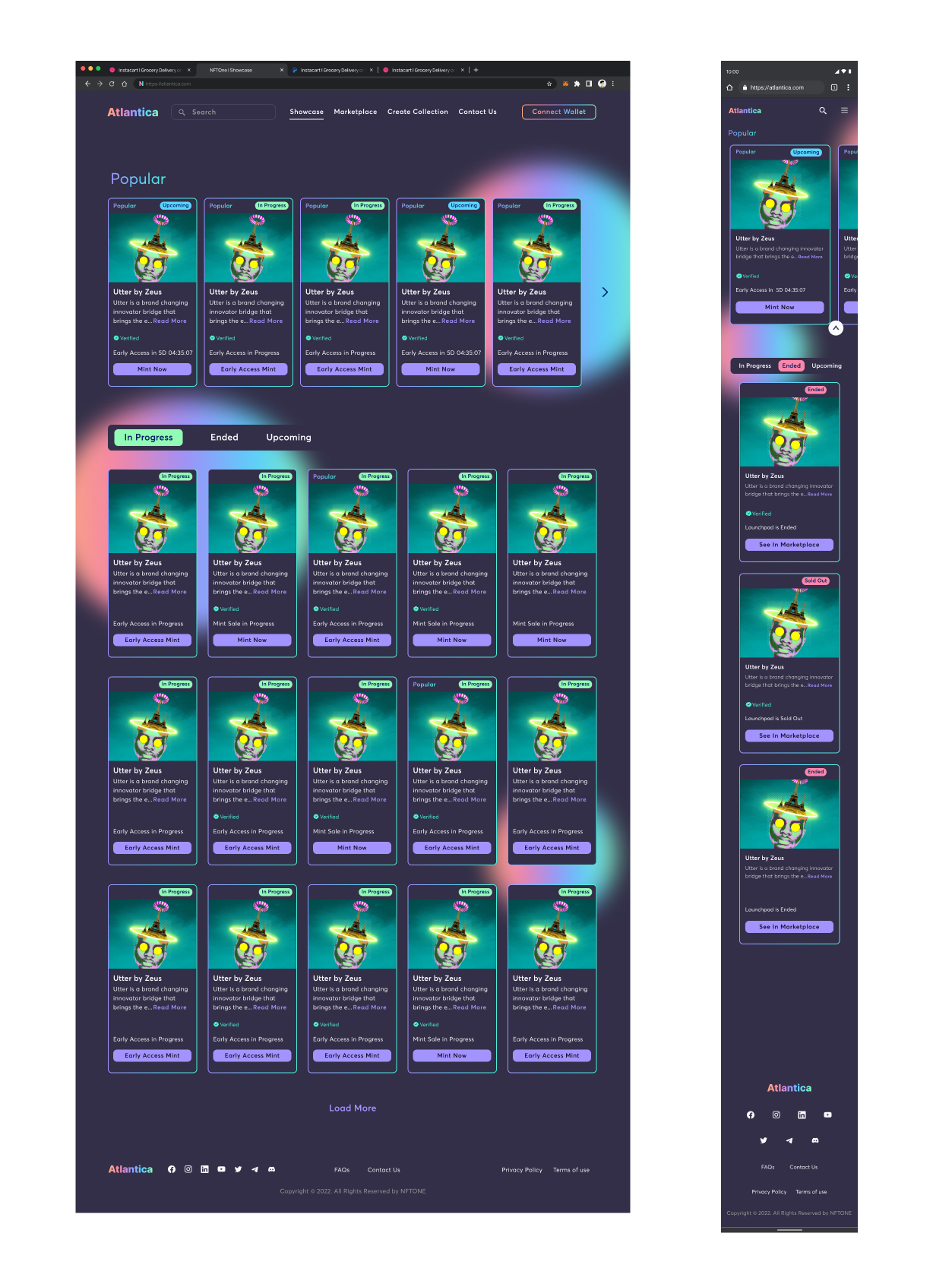
I majorly explored the high-fidelity UI in dark mode. Dark mode UI has been favoured in the past few years due to its sleek look and design accessibility. The gradient strokes around the project cards and the gradients in the page background gave it a more modern and futuristic look, which is common with web3 products. I did a few animations in the Prototype so as to give a feel of the interactions.
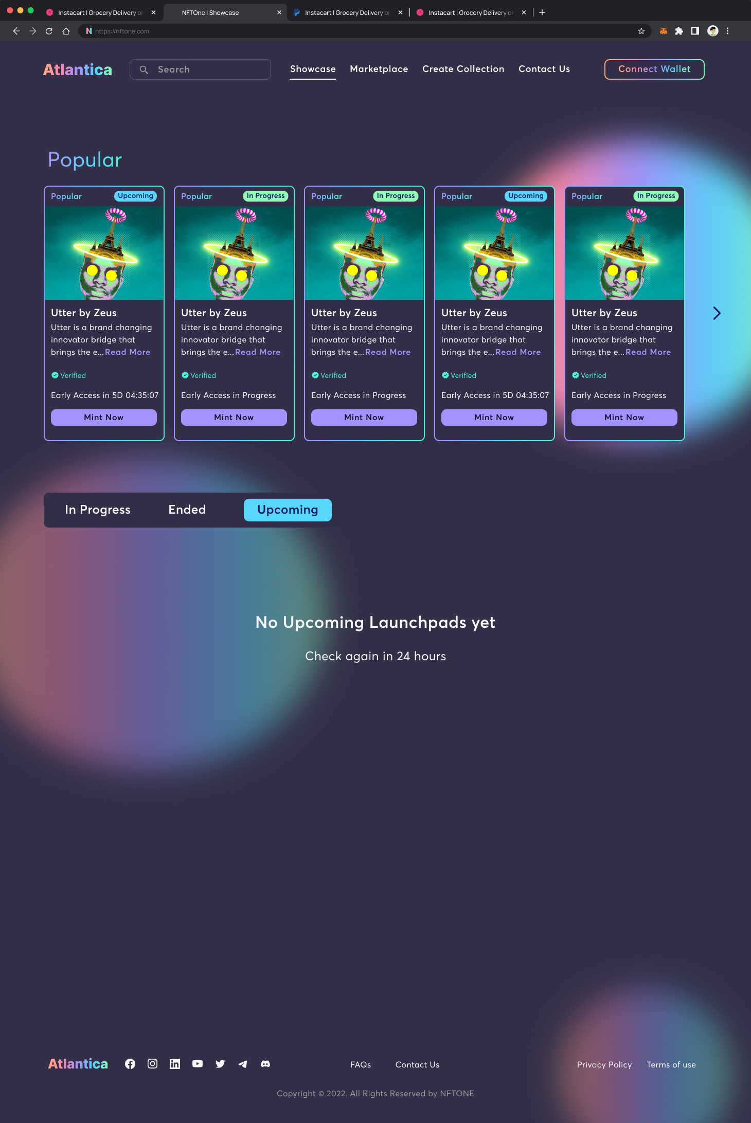
EMPTY STATE
TAKEAWAYS AND NEXT STEPS
The next steps will involve designing the layout when the project card CTA is clicked. Will it open a new page? What information will it contain? Also, will the Showcase page have a Hero section preceding the launchpads? The Hero section will give some insight into what the page is about before displaying the launchpads. Just before the footer, a “Launch Your Project” CTA section may be added to encourage visitors to launch their NFTs with the platform.