The word “Oga” is a vernacular word in some parts of West Africa meaning someone in a position of authority. Oga Shoes is a mobile e-commerce app for men’s shoes.
Duration: July 2022 – September 2022 Role: UX Designer Responsibilities: Research, Sketching, Wireframing, Prototyping, Testing.
THE PROBLEM
Making purchases on e-commerce platforms has been met with several shortfalls. Some have complained about the disparity between what they see online and the actual product when delivered. Others are dissatisfied about the return policy stated by most e-commerce platforms in Lagos.
HYPOTHESES OF THE PROBLEM
The following are hypotheses I set out to verify in this case:
1. Trust between fashion e-commerce platforms and users is lacking
2. Users want to be able to easily return purchased clothing items if they don’t fit.
3. Majority of working class Lagosians regularly have old clothing/footwear they no longer use.
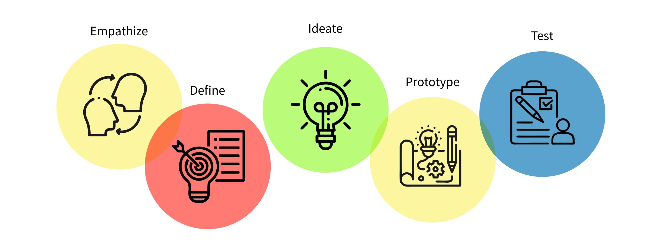
DESIGN THINKING FRAMEWORK
SECONDARY RESEARCH
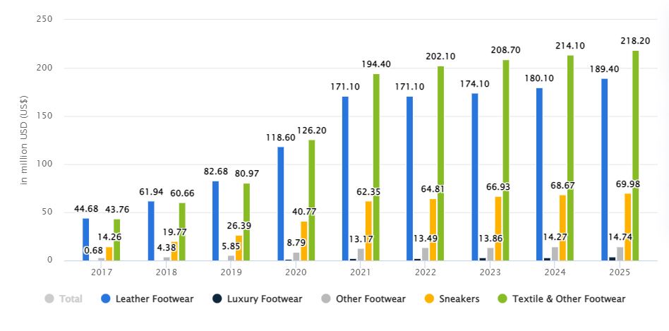
According to research reported by Statista, revenue in the Footwear market is projected to reach US$454.20m by the end of 2022 – leather and textile footwear topping the charts. There is an expected annual growth rate (CAGR 2022-2025) of 3.00%, resulting in a projected market volume of US$496.30m by 2025. The number of users is also expected to reach 67.4m users by 2025, with an increase in penetration from 19.6% to 28.9%.
Such promising statistics prove that the footwear business in Nigeria is growing and not going away anytime soon.
USER RESEARCH
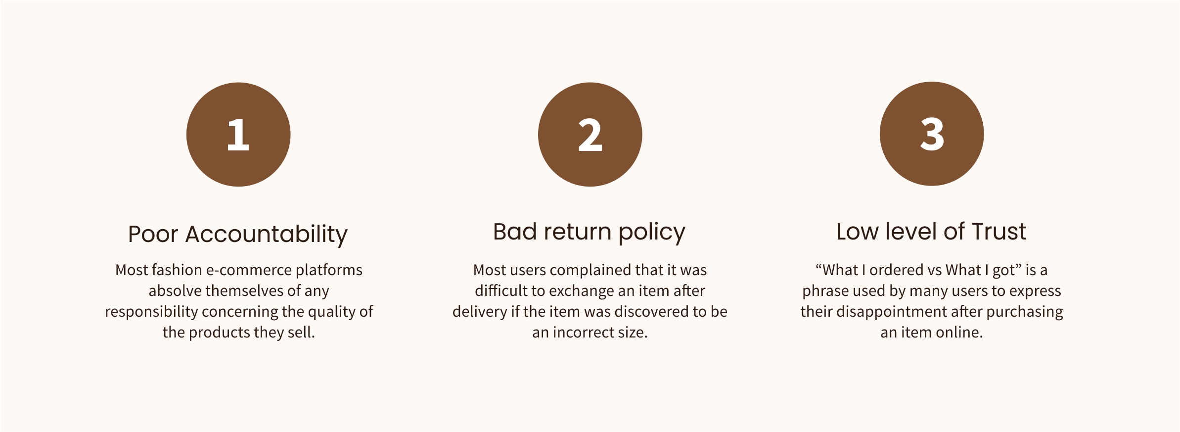
I started my research by conducting interviews with 10 individuals between the ages of 18-45, educated, working class, tech-savvy, and making online purchases at least once quarterly. My goal was to find out the challenges they faced when making purchases on e-commerce apps, how they felt about the return policy on the app(s) they use, and how supportive they were of recycling strategies. These were the major pain points I uncovered:
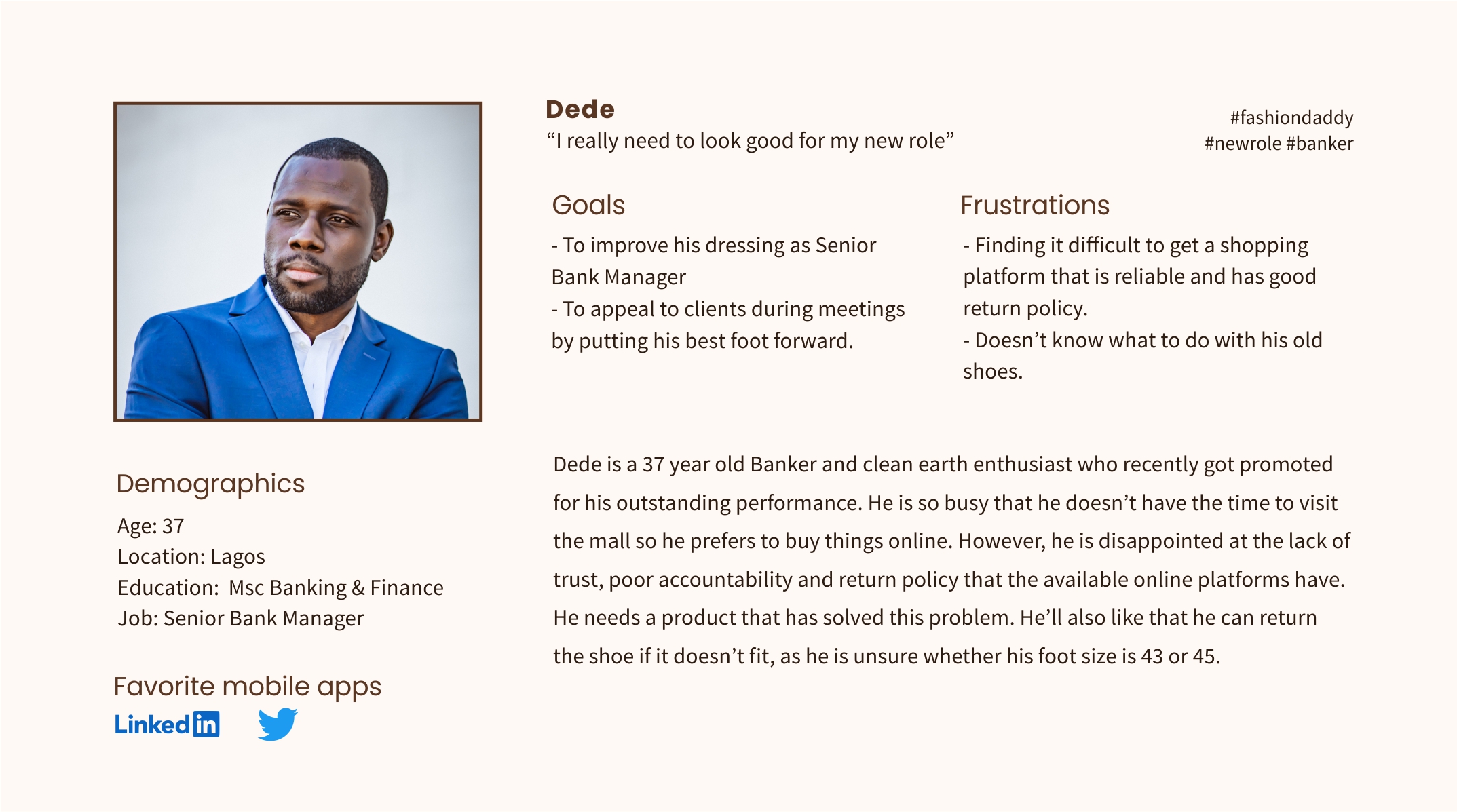
USER PERSONA
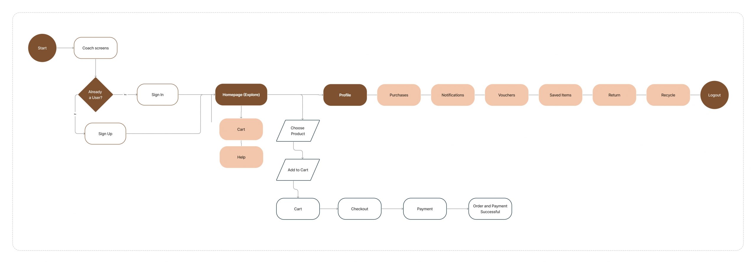
USER FLOW
Based on the research, I came up with a user flow diagram to have a bird’s eye view of the design. It highlights the key features of the app and a quick flow from start to order completion.
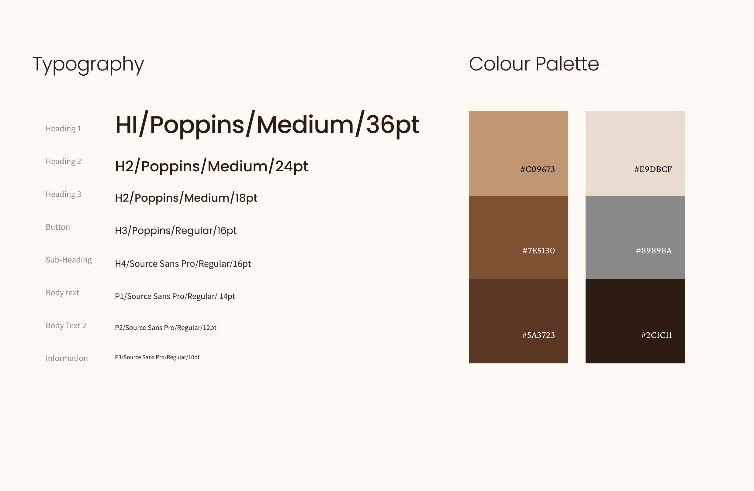
STYLE GUIDE
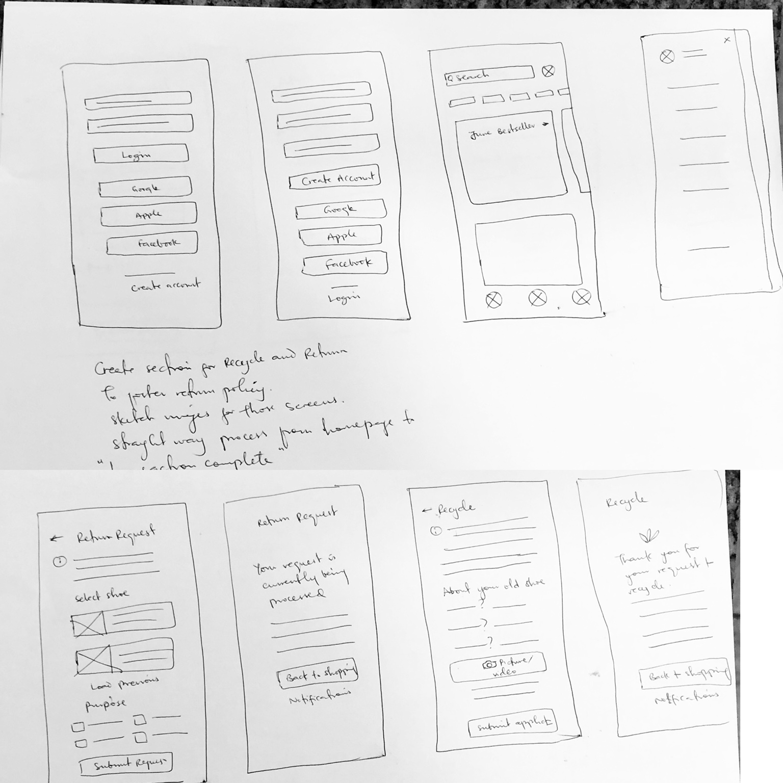
SKETCHING / PAPER WIREFRAMES
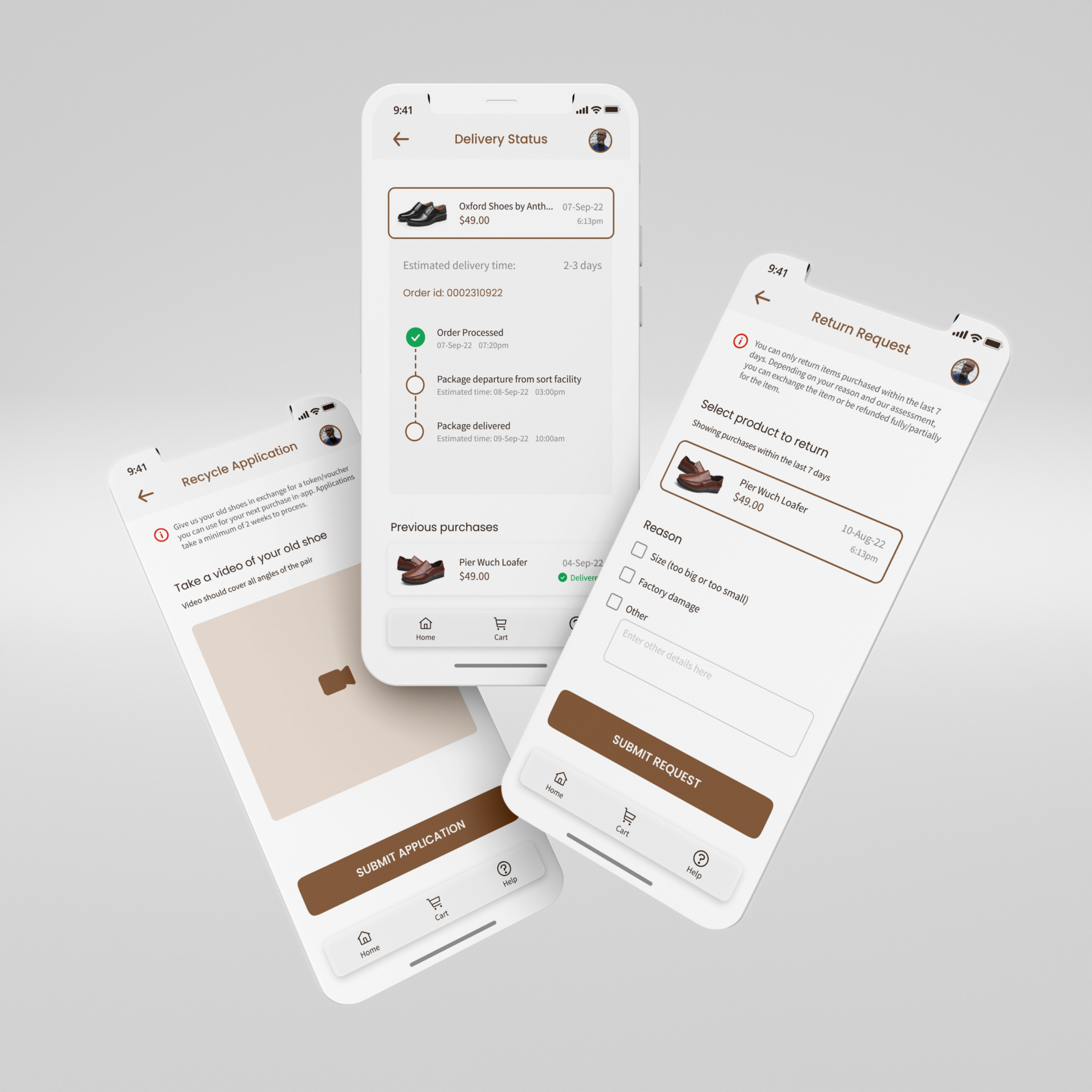
I sketched out ideas for the app screens: how each app page should look, and its features. I took some time to sketch how a “Return” and “Recycle” screen would look like. There aren’t many ecommerce mobile apps with these features so I had to use my imagination and information I had drawn from the research most of the time.
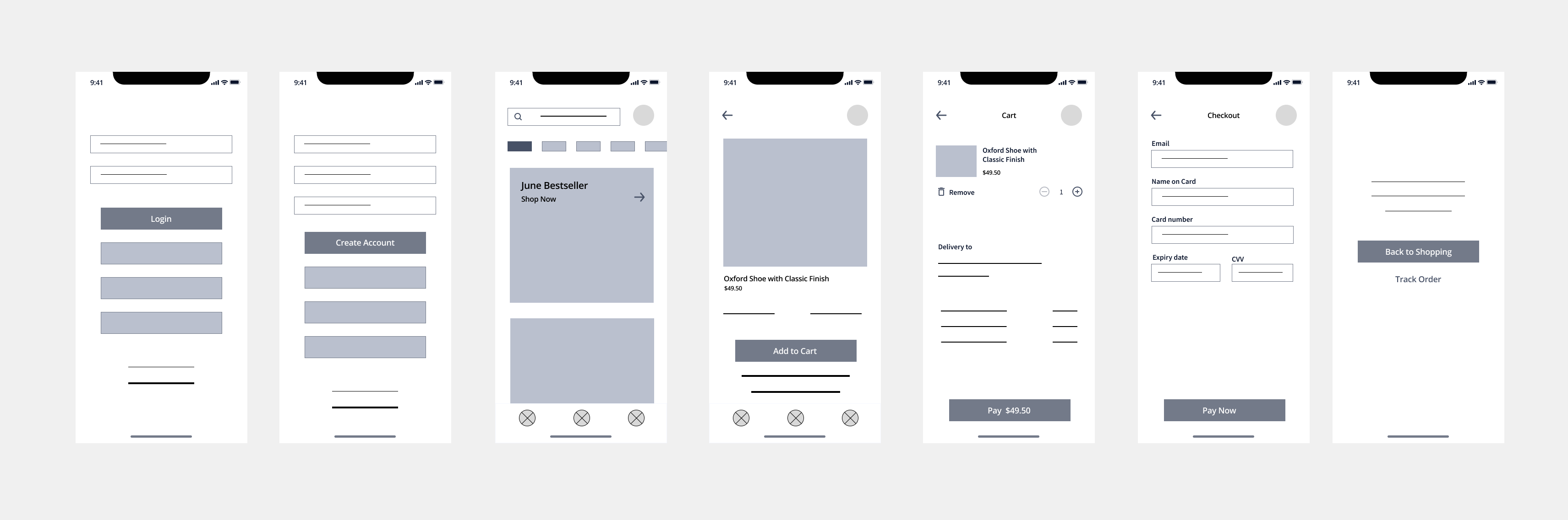
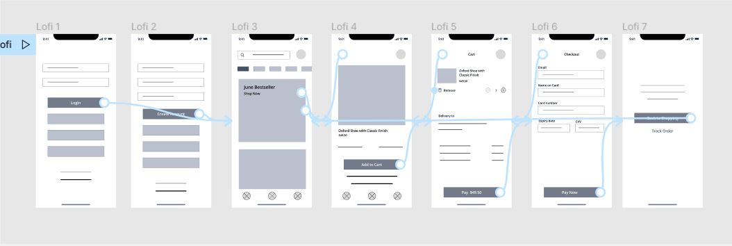
DIGITAL WIREFRAMES
I moved on to create the digital wireframes of the sketches and a low-fidelity prototype of a simple purchase flow.
USABILITY STUDY
I conducted an unmoderated usability study with 10 participants and using an affinity map, I was able to group the feedback and see areas in the design that needed to be reviewed. Based on the study, I made a few revisions to the design. I added more sections to the product and cart screens in order to upsell more products. I also added “Share” and “Save” icons to the product page, and consequently “Saved items” to the Slide-in menu.
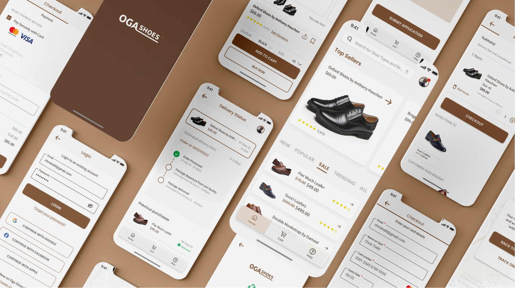
HIGH FIDELITY DESIGNS
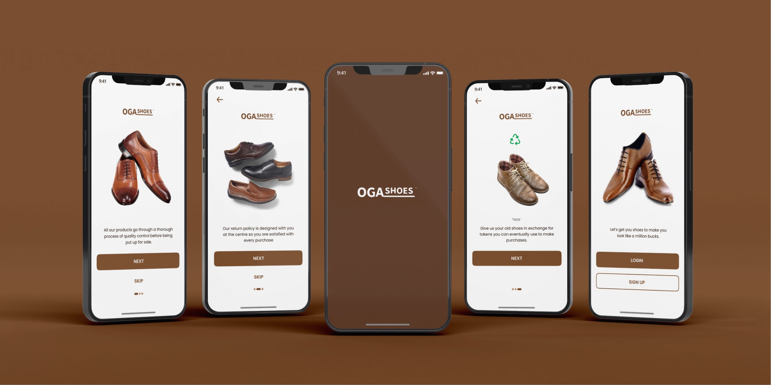
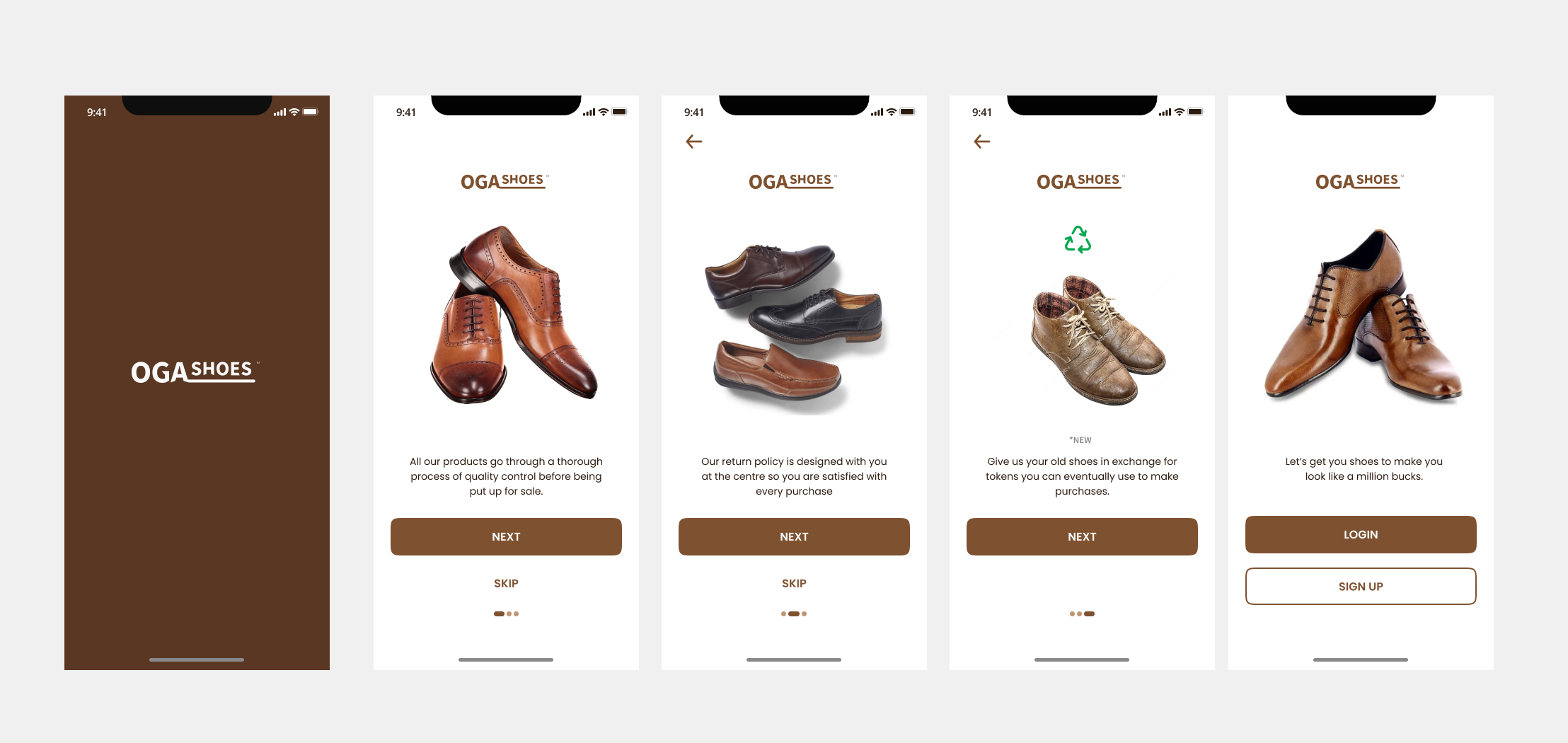
ONBOARDING SCREENS
The onboarding screens give the user an overview of the app’s features on first use. It can be skipped.
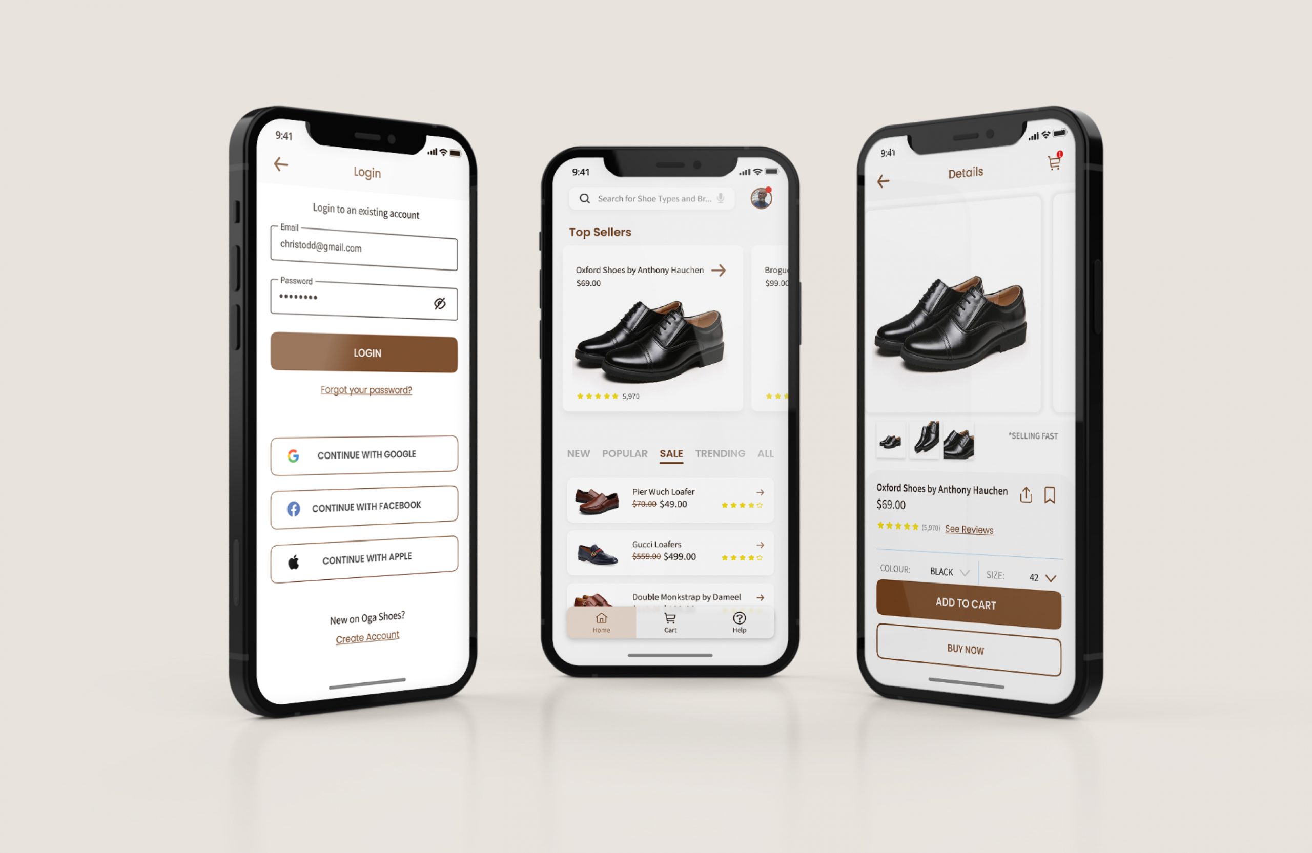
SIGN IN/UP
PURCHASE FLOW
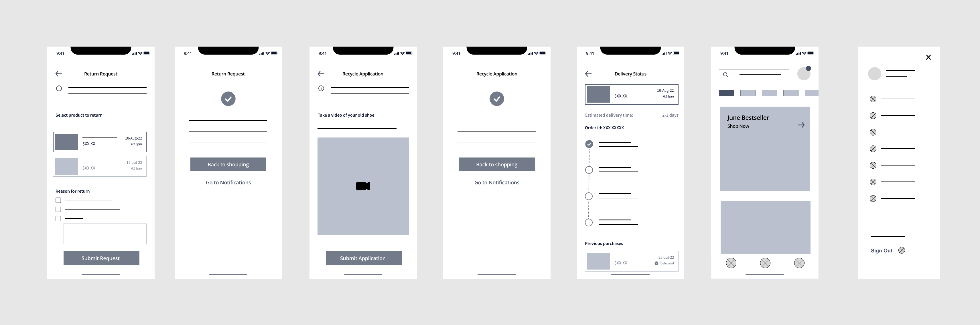
TRACK ORDER, RETURN AND RECYCLE FEATURES
ACCESSIBILITY CONSIDERATIONS
Making the product accessible to a diverse set of users requires critical thinking. As I designed, I considered text hierarchy, WCAG-accepted colour contrast, labeled icons, responsiveness, and features to aid those with disability (eg. voice search).
TAKEAWAYS AND NEXT STEPS
The results of this project shows just how effective user-centered design is and how important it is to trust the process. The project seemed cumbersome at the beginning especially because I was expected to come up with screens for Returning and Recycling items. As I trusted my research and the process from sketching to high-fidelity mockups, everything came together nicely. Nonetheless, more will be learned as the product undergoes more user testing.